Trends burn bright and burn out. These five revivals carry centuries-old letters into the present, and they are still doing some of their best work today.
Read the full article at buff.ly/Rcsha5d
A Didone made for the page. Mondial Text by Lukas Schneider revives Hans Bohn’s 1930s design, with abrupt shifts from thin to thick strokes and a pronounced vertical stress that add art deco grandeur to a book’s text.
👉 License Mondial Text at typenetwork.com
Brickie Variable by Juanjo López is a semi-serif family with a wide range of widths and weights, built for the boldest posters in its extreme styles and the most legible text in its regular zone.
👉 License Brickie Variable at typenetwork.com
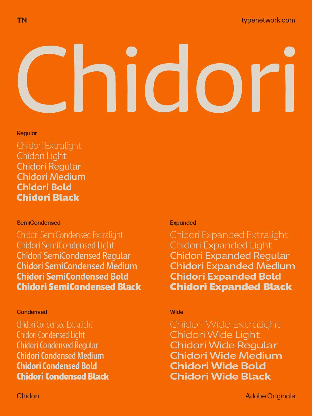
Chidori by Frank Grießhammer began as the Latin counterpart to Momochidori, the Japanese typeface from Adobe Originals. It carries the same quirky, humorous, and approachable spirit, inspired by the Showa Era.
Free from having to match Momochidori’s Japanese design, Chidori’s
Parry and Parry Grotesque by Artur Schmal have their roots in the robust slab serif and sans serif typefaces of the Victorian age, but they aren’t revivals. Soft curves and quirky serifs meet sharp-cut stroke endings, giving a text image that’s softer than most slab serifs. Get